Selecting paint tones room-by-room can transform a home in Orlando, FL by balancing natural light, architectural detail, and lifestyle needs. Warm sunlight and humid air influence how colors read on walls. The city’s mix of historic bungalows in neighborhoods like College Park and newer homes in Lake Nona calls for thoughtful choices that complement each property type. The following sections examine practical steps and design strategies for choosing paint tones that enhance space, mood, and resale appeal.
Assess Natural Light And Orientation
Examine how sunlight moves through each room throughout the day. East-facing windows bring bright morning light that makes cool blues and soft greens feel fresh. West-facing rooms receive warm afternoon light that enhances richer tones and golden neutrals. North-facing spaces often have steady, cooler light that can mute warm hues and make pale colors appear gray. South-facing rooms usually deliver abundant light that keeps saturated shades lively.
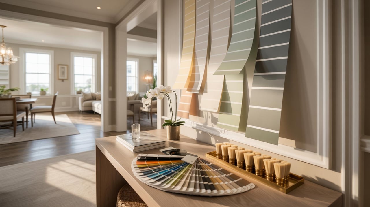
Place sample swatches on each wall to observe changes at different times. Paint large poster board pieces rather than small chips to see how color reads across square footage. Note the finish — matte absorbs light and can soften imperfections while satin and eggshell reflect more light and add subtle sheen.
Match Color To Room Function
Consider how a room is used and choose tones that support those activities. Bedrooms benefit from calming shades that encourage rest, such as muted lavenders or warm taupes. Living rooms can host conversation and relaxation, so mid-tone neutrals with accent walls provide a balanced backdrop. Home offices require focus — cool neutrals or understated blues foster concentration. Kitchens often gain energy from crisp whites or soft greiges that contrast with cabinetry and hardware.
Balance aesthetics with longevity by choosing tones that remain appealing through style changes. For formal spaces, aim for restrained classic tones. For high-traffic areas, pick colors that hide scuffs and show less dirt — deeper neutrals can be practical without sacrificing style.
Coordinate With Fixed Elements
Survey permanent features before selecting paint. Flooring, cabinets, tile, and built-in millwork set a palette baseline. Dark hardwood floors pair well with light to medium wall tones to maintain contrast. Pale floors allow for richer wall colors without overwhelming the space. For rooms with bold tile or patterned backsplash, select a wall tone that echoes a subtle hue from the tile to create harmony.
Consider hardware and fixture finishes — brushed nickel and chrome often look best against cooler walls while brass and bronze can warm up stone or wood tones. If planning to replace fixed elements, decide whether paint should match current finishes or the intended new ones.
Create Flow Between Rooms
Establish a cohesive palette that links spaces while allowing each room to keep its identity. Use a dominant neutral throughout public areas as a unifying backdrop. Layer accent colors in adjacent rooms to create variety without visual disruption. Transitional spaces like hallways and foyers can adopt a slightly lighter or darker version of adjoining room tones to guide movement.
Open floor plans benefit from subtle shifts in hue rather than abrupt changes. Carry trim and ceiling colors consistently to maintain continuity. For homes with multiple levels, repeat at least one color family to tie floors together.
Test Samples In Real Conditions
Apply large paint swatches on interior walls and observe them across morning, afternoon, and evening light. Test areas should receive the same amount of light that the final painted wall will get. Allow swatches to dry fully before making a judgment — wet paint can read differently. Evaluate swatches next to furniture and fabrics that will remain in the room, since upholstery and rugs influence perceived color.
Use temporary wallpaper or large poster board painted with samples when checking color in sunlight-exposed rooms. Photograph samples under different lighting to review later, but rely on direct observation for final decisions.
Choose Undertones With Care
Identify a color’s undertone before committing — warm undertones include yellow, peach, or red while cool undertones include blue, green, or violet. Two similar colors can look unlike because of differing undertones. Warm undertones harmonize with wood tones and warm metals. Cool undertones pair well with stainless finishes and modern materials.
Hold swatches next to one another to spot undertone shifts. If the home has mixed materials, pick undertones that bridge those materials so colors do not clash. When uncertain, select a neutral with a balanced undertone that reads well across light conditions.
Select Trim And Ceiling Colors Strategically
Decide whether trim and ceilings will match walls or provide contrast. Crisp white trim creates clean edges and highlights architectural detail. A soft off-white can warm a room without stark contrast. Painting ceilings a shade lighter than walls can make a room feel taller while a white ceiling reflects more light and brightens space.
For rooms with ornate molding, slightly brighter trim brings attention to craftsmanship. In rooms with low ceilings, matching ceiling and wall tones reduces visual boundaries and can open the space. Consider touchpoints like doors and stair spindles when choosing trim color to ensure a unified treatment.
Use Accent Walls And Focal Points Thoughtfully
Accent walls add drama when used with purpose — behind a bed, around a fireplace, or at the end of a long room. Choose an accent hue that contrasts with the main wall color while complementing furnishings. Textured finishes, wallpaper, or paneling can amplify the effect without committing to a bold color across every wall.
Limit accent walls to a single focal area to avoid visual fragmentation. When dealing with small rooms, a darker accent can create depth. In large rooms, accent areas can anchor seating arrangements or define zones within an open plan.
Account For Exterior Views And Outdoor Spaces
Consider the relationship between interior tones and outdoor elements. Homes near lakes or canals benefit from colors that harmonize with water tones and lush vegetation. Rooms that open to patios or gardens should have colors that connect inside and out to create a seamless transition. For homes in tight city lots, light neutral walls can offset limited exterior views and keep interiors airy.
When selecting paint for rooms with large windows, remember that exterior reflections can subtly shift perceived color. Sample swatches should be viewed with doors and windows open to see how external light affects the tone.
Factor In Resale And Buyer Preferences
Choose colors that appeal to a broad range of buyer preferences while still reflecting personal taste. Soft neutrals and understated warm tones often support resale by providing a versatile backdrop for a variety of furnishings. Bold finishes can be reserved for smaller, easily repainted areas when preparing a home for market.
Coordinate with a trusted real estate agent to understand local buyer trends in neighborhoods like Winter Park or Baldwin Park. Agents often note which finishes attract attention and which colors help photos and showings present the home at its best. When updating paint for sale, prioritize rooms that influence first impressions — entryways, main living areas, and the primary suite.
Final Touches for Color Confidence
Choosing the right paint tones room-by-room can elevate both the look and feel of your home, turning functional spaces into personalized retreats. Balance bold accents with calming neutrals, consider how natural and artificial light change throughout the day, and trust simple color theory principles to guide cohesive choices. If you’d like expert guidance tailored to your home, connect with Gaby Sadler for personalized recommendations and color consultations. Contact Gaby today to get started on a palette that truly reflects your style and enhances every room.